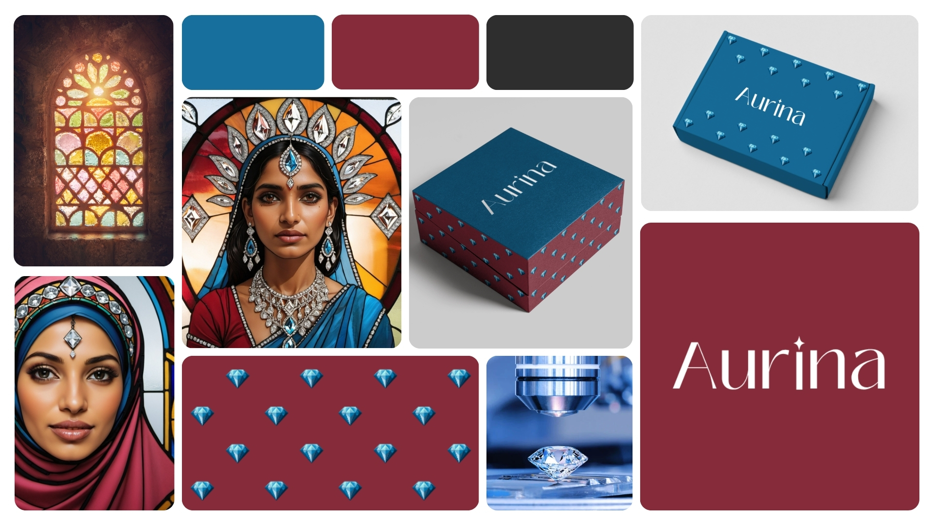
Aurina Labs makes diamonds in a laboratory. Komorebi was asked to make that feel like power — not apology. The result: a brand language that treats lab-grown not as the ethical alternative, but as the only intelligent choice.
Aurina Labs came to Komorebi with something extraordinary: a product that is physically, chemically, and optically identical to a mined diamond — grown in a laboratory in a fraction of the time, at a fraction of the environmental cost. The science was flawless. The brand was not yet speaking its full truth.
The challenge was not to explain what lab-grown diamonds are. It was to make the person who wears one feel exactly what they should: powerful, precise, and ahead of the world.
The existing luxury jewellery language — legacy, heirlooms, rarity — was built to serve the mining industry. Aurina needed its own language. One that belonged to its customer: a woman (or man) who makes deliberate choices. Who doesn't need permission. Who sees intelligence as its own form of elegance.
Komorebi developed the concept positioning, visual identity direction, colour system, packaging concept, and brand voice — building Aurina as a symbol of conscious power, not conscious compromise.
Lab-grown is almost as good as mined
The responsible choice for conscious consumers
Affordable luxury for those who care
Sustainable jewellery for a better world
Identical. Grown with intention, not extraction
The choice of someone who thinks before they wear
Power without apology. Brilliance without compromise
The future of fine jewellery, already here
The visual language draws from stained glass — light refracted through structure. Crimson for power. Sapphire for clarity. Near-black for precision. A woman who wears Aurina doesn't explain herself.
A complete strategic reframe — from ethical alternative to conscious power symbol. Messaging architecture, brand personality, and tone of voice built around deliberate choice and quiet confidence. Never apologetic. Never tentative.
Colour palette: deep crimson, sapphire blue, near-black. Typography rooted in elegance with edge. The Aurina mark — a wordmark with a diamond-point accent — designed to sit with the same authority as any legacy jewellery house, without borrowing their language.
A signature box system in crimson and sapphire — each surface bearing the Aurina diamond motif. The unboxing experience designed to feel like receiving something that was made precisely for you. Because it was.
Aurina Labs doesn't need to explain lab-grown diamonds to the world. The world is catching up to Aurina. Komorebi's work was simply to make that truth visible — in a colour, in a mark, in a box, in a word.
A diamond grown in a laboratory and a diamond pulled from the earth are the same stone. Only one of them arrives without harm. Aurina wears that fact not as a badge of guilt-free shopping, but as a declaration of intelligence. That is the brand. That is the power.